Wednesday, 16 December 2015
My perspective of magazines
After my magazine recreation, I developed an even greater understanding of magazine production. After the recreation, I developed skills in software such as Photoshop as well as a greater development of using Blogger. Despite doing these tasks last year in AS, the skills used this year have been more advanced and useful to creating a high standard magazine.
Today's Targets
To do:
-Plan Evaluation Q1 - look for inspiration from past students
-Check SPaG on products
-Look to improve blog
-Plan Evaluation Q1 - look for inspiration from past students
-Check SPaG on products
-Look to improve blog
Monday, 14 December 2015
Product Progress

Today's Aims
To cover:
-Feedback for website all together (Peer and Teacher)
-Plan Evaluations
-Check SPaG for blog
Friday, 11 December 2015
Article Draft
This is a draft of my article for my WIX website.
The evening started off on a sombre note as the rockers walked on stage lit in the colours of the French flag, a day following the Paris Atacks. which jepordised the show taking place. After a minute’s silence, lead singer Dan Reynolds spoke emotionally on how the band was keen to bring music that “brings happiness and peace”. The band definitely reintroduced happiness in the emotional atmosphere as the crowd went wild from the first note of their upbeat debut single, It’s Time. Songs from the new album, Smoke + Mirrors, Trouble and Shots were followed by a beautifully understated rendition of Forever Young, which was without a shadow of a doubt one of the many highlights of the evening. The emotion of the track and the crowd lead Reynolds to tears, highlighting his response to the selfless actions. Next up was I’m So Sorry – which was kicked off with a solo from lead guitarist Wayne Sermon– and Gold to bring a high volume of intensity in allignement to the rock vibes consstently given off. As the gig entered its final stages, the Grammy winners reached their top tracks. The emotion of the track and the crowd lead Reynolds to tears, highlighting his response to the selfless actions. Finally to end what was an impressive show, the band unleashed their most well-known electrfying hit. Radioactive, much to the approval of the audience who went into overshock with all souls in rhythm. After the encore of The Fall, the band walked into the middle of the stage and took a bow as a sea of tissue paper leaves fell on the crowd. On reflection to the crowd, more than an ovation was deserved.
The evening started off on a sombre note as the rockers walked on stage lit in the colours of the French flag, a day following the Paris Atacks. which jepordised the show taking place. After a minute’s silence, lead singer Dan Reynolds spoke emotionally on how the band was keen to bring music that “brings happiness and peace”. The band definitely reintroduced happiness in the emotional atmosphere as the crowd went wild from the first note of their upbeat debut single, It’s Time. Songs from the new album, Smoke + Mirrors, Trouble and Shots were followed by a beautifully understated rendition of Forever Young, which was without a shadow of a doubt one of the many highlights of the evening. The emotion of the track and the crowd lead Reynolds to tears, highlighting his response to the selfless actions. Next up was I’m So Sorry – which was kicked off with a solo from lead guitarist Wayne Sermon– and Gold to bring a high volume of intensity in allignement to the rock vibes consstently given off. As the gig entered its final stages, the Grammy winners reached their top tracks. The emotion of the track and the crowd lead Reynolds to tears, highlighting his response to the selfless actions. Finally to end what was an impressive show, the band unleashed their most well-known electrfying hit. Radioactive, much to the approval of the audience who went into overshock with all souls in rhythm. After the encore of The Fall, the band walked into the middle of the stage and took a bow as a sea of tissue paper leaves fell on the crowd. On reflection to the crowd, more than an ovation was deserved.
Thursday, 10 December 2015
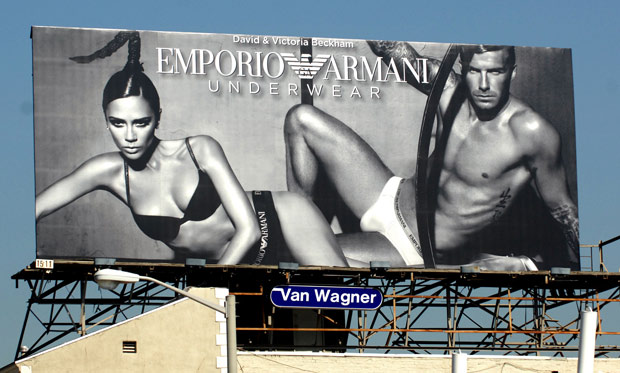
Billboard Inspirations
This aspect of my final products was hard to achieve. Despite the popularity of most male magazines, billboards are rarely used to advertise the magazines, using social media platforms instead to grasp the technological age.
As a result, I used fashion billboards instead.
Emporio Armani
Despite this appealing to both male and females, this billboard was unique in order to create popularity of the brand. The use of sexual appeal broadened attention towards the billboard and the brand. Moreover, the use of black and white colour not only made the models stand out, but also add to the original look of the billboard.
Wednesday, 9 December 2015
Website Inspirations
The main two male magazines - GQ and Men's Health both influence and inspire me. Their websites were a heavy influence to creating my own.
GQ
This website was my favourite. The layout was exceptional and instantly grabs the reader's attention. Moreover, the tabs at the top of the page also inspired me to create a similar version. The layout and structure of the main images were also a personal favourite of mine.

Men's Health
This was also a website I was fond of. The tabs were also similar to my own and the whole website stood out. The colour scheme was immense and also was clear and crisp. The use of images were very clear and also linked well to the target audience as well as the articles relevant. The use of social media at the top of the page was also a website concept I used.

Today's Tasks
To do:
-Gain DPS Feedback
-Restructure layout of website report
-Add site map for website
-Gain DPS Feedback
-Restructure layout of website report
-Add site map for website
Monday, 7 December 2015
My perspective on Billboards
Creating my billboard was difficult. Male magazines rarely use billboards as an advertising strategy, instead using social media. Due to this, I felt my billboard recreation was inadequate. I incorporated regional features to outline it's regional availability as well as use text to identify the features of the magazine. Following this, I have developed a better understanding of billboards. Initially, I thought that billboards were easy to make. However, I have learnt how they must instantly grab the reader's attention and use specific features to stand out and create attention.
Today's Targets
To cover:
-Add images to DPS
-Create report on website - layout focus
-Gain feedback for Billboard
-Add images to DPS
-Create report on website - layout focus
-Gain feedback for Billboard
Wednesday, 2 December 2015
Product Progress

Today's Aims
To do
-Gain peer feedback of magazine article
-Plan other aspects of website
-Incorporate media rich in blog
-Add text to DPS
-Gain peer feedback of magazine article
-Plan other aspects of website
-Incorporate media rich in blog
-Add text to DPS
Monday, 30 November 2015
WIX Template Research
Before creating my website, I looked at various templates to use. I did this in order to have a grasp of what a website would entail and look like, as well as combine templates with other male magazine websites. On WIX, I researched templates such as 'Events Production','The Band' and also 'Interior Designer Firm'. Despite this research, I settled on the 'Fashion Portfolio' template as I felt that my website would suit that more via the layout.


Today's Aims
To do:
-Gain peer feedback for website article
-Improve contents page
-Restructure layout of DPS
Blog Progress

Wednesday, 25 November 2015
Targets
-Aim to create main article for website
-Start to rename tabs on website
-Rename some tabs on blog
-Gather feedback for contents page
-Start to rename tabs on website
-Rename some tabs on blog
-Gather feedback for contents page
Monday, 23 November 2015


Wednesday, 18 November 2015
Facial Expression Research - Trevor Millum
Millum identified four facial expressions by men in magazines:
-Carefree
-Practical
-Seductive
-Comic
-Catalogue
The expression of my model on the front cover of my magazine conformed to the Practical expression. My model followed suit to this expression, focusing on the camera to stare at the reader and looking very concentrated.
My model for my contents page followed suit to the facial expression theory of Margorie Ferguson. The model applied to the chocolate box expression; using a half-smile (similar to a smirk) and gazing into the camera, also conforming to a seductive expression as well.
Masthead Ideas
I had a variety of ideas on which font/colours to use to create my masthead. I wanted the masthead to follow suit to magazines such as GQ, establishing a masculine look on the magazine and be the USP of the product.
Fonts I considered were:
DK Katzenjammer Regular
Chalkduster Regular
Andale Mono Regular
Oriya MN Bold
War is Over Regular
Century Gothic Regular
Eventually, I decided to use the Dk Katzenjammer font for my masthead as it displayed a thorough masculine look as well as looking suitable for a male magazine. Moreover, the ruggedness of the font also linked to the rough reputation of the North East, the location of the magazine - making me wanting to choose this font even more.
Today's Targets
-Gain feedback on website homepage
-Plan articles on website
-Improve billboard
-Look for faults of front cover to improve
-Plan articles on website
-Improve billboard
-Look for faults of front cover to improve
Monday, 16 November 2015
Target Audience Interview
Due to complications of the interview being uploaded, a transcript of the interview has been uploaded instead.
What parts of this magazine (Men's Health) front cover appeal to you?
"I like the layout of the magazine, all text is placed perfect to align with the main image, which outlines a sense of masculinity. I also like how the masthead is placed centre-top as it will be seen straight away by the reader."
Do you think a regional magazine would be more interesting?
"If it had the right and suitable features, then yeah, a regional magazine would be more interesting. Most international or national magazines barely include all regions, leaving them out, it isn't fair."
What other male lifestyle magazines do you read and are aware of?
"I mainly read Men's Health and GQ. I've heard of the likes of Esquire but barely read it."
Should a magazine have the right value for money?
"I think it's a bit ridiculous to pay £5 for a few pages. There needs to be a big value of money, especially for a magazine."
What features in a magazine would appeal to you?
"Stuff like food, technology and fashion interest me the most, those would be the articles that would stand out to me."
Would you like to see local fashion included?
"I agree that local fashion should be included, it can reflect on the success of local independent retailers and their progression in the age of fashion."
And finally, what is your ideal magazine?
"My ideal magazine would have articles on food, technology, fashion and sport. And the front cover would have to really be unique and grab the reader's attention straight away."
Today's tasks
Cover:
-Begin layout of website
-Think of ideas how to make homepage
-Start to gather peer feedback
-Begin layout of website
-Think of ideas how to make homepage
-Start to gather peer feedback
Tuesday, 10 November 2015
Product Progress

Monday, 9 November 2015

Wednesday, 4 November 2015

Monday, 2 November 2015
Overall view on Deconstructions
Overall, I am very happy with the deconstructions created. Although it was difficult to produce billboard deconstructions due to the lack of availability of them, I managed to complete deconstructions of magazines and websites. These deconstructions increased my perspectives of other magazines and competitors as well as develop my analytical deconstruction skills. Moreover, the use of deconstructions has helped me gather which codes and conventions to follow that were used by similar male magazines. For example, I will follow the tabs convention that GQ and Men's Health used. This will increase the professional look of my website as well as create ease for the reader to explore the website.
My views on Similar Products
This part of the blog was very inspirational in my research of other male magazines. Moreover, the use of similar products improved my knowledge of generic magazine conventions, as well as the difference of national and regional magazines. Additionally, this part of the blog also made me specify my target audience and who to appeal to.
Monday, 26 October 2015
Blog Feedback
Deconstructions and Recreations –
· Font ideas should be under Inspirations, please change label to create a new top tab.
· Colour scheme see above
· Generic conventions post great start, could you expand further please, please look at Ben Carter’s blog under further research for more ideas please.
· Deconstructions overall please comment on how the task has helped you, what codes and conventions will you follow/challenge?
· Flat plans should be under Flat Plans and Rationales, please re-label them
· Rationales are not detailed enough please go to my blog for a reminder, emleslie.blogspot.com, A2 coursework. Please also make it clear how you will link in regional to your magazine, billboard and website in the rationales.
· Where is your billboard recreation? As you have never completed a billboard before what have you learned from this activity?
Magazine Influences –
· How will you compete with this magazine? Be specific.
· Good post on national v regional
· Institutional logos, this post is about the magazine not the insitutions, they are Bauer and Emap. Please double check who publishes these magazines you have mentioned.
· DPS influence – how does it influence you, be specific.
· Moodboard, comment on how it helps you, what have you learned about front covers for men’s magazines.
· Billboard deconstruction – but no deconstruction?
Model Organisation –
· Location scout missing
· Recce missing, see Moodle for the worksheet
· Photoshoot planning worksheet missing, see Moodle for that worksheet
· Weather reports only useful if you are going out on location
· Comment on photos from photoshoot – which will you use and why, why are some not suitable.
· Final costume, make up, hair and prop ideas on here too please
· Organisation of model needs to be excellent, think how you could stretch you work a little further.
Potential Images –
· Comment on these photos, why are they suitable, this should be under Inspirations please re-label.
Potential Target Audience –
· Audience Profiles, WHY would they buy your magazine?
· What have you learned from the reader profile that supports your design/content ideas?
· There is a blog progress post in there, should be under time management.
· Survey analysis – HOW does it help you? Explain.
· There is a calendar for October in here should be under time management.
· Target audience alphabet, this was a starter activity don’t include it
· Post on media rich platform, please also remove this was a class activity.
· Blog progress again not needed here but under time management
Inspirations –
· Need to create a tab on inspirations
· Colour scheme ideas, narrow down final ideas and explain why it’s the best to use
· Font ideas see above
· Masthead name ideas as above
· Costume, hair, make up, props ideas, could expand to look at pose and facial expressions
· Websites, billboards and magazines – why do they inspire you
Deconstructions
The deconstructions of my magazine influences have helped myself gather thought and insight into creating a sufficient and excellent magazine, competing with the likes of global brands such as GQ and Men's Health. Moreover, the deconstructions have helped with excelling with magazine features such as mastheads, tag lines, sell lines and headings.
Institutional Research
Institute Logos that I have considered include Bauer Media Group and Time Inc. UK. Both of these institutes were highly considered as they have previously and currently created magazines that can be seen to have similar criteria of my magazine as well as producing these magazines in similar target audiences as I intend to have.


How magazine will be regional
To make my magazine regional, I will use images from around the region, such as Newcastle and Sunderland, creating a regional theme. Furthermore, the magazine will also feature articles predominately about the local area, and interviews will be with local celebrities, unlike international figures in worldwide magazines in order to establish a constant region theme with the magazine.
Wednesday, 21 October 2015
Today's Tasks
To cover:
- Continue improving blog
- Restructure billboard layout
- Improve Contents Page
- Continue improving blog
- Restructure billboard layout
- Improve Contents Page
Monday, 19 October 2015
Reflection
This lesson I have managed to complete my reader profile as well as create a colour palette which is to be published and finish off a calendar for time management.

Today's Targets
- Flat Plans: 4 Magazine
1 Billboard
3 Website
- Rationale for each individual page:
Composition Framing
Layout
Flats
Colours
Shot size/angle
Mis-en-scene
Language
1 Billboard
3 Website
- Rationale for each individual page:
Composition Framing
Layout
Flats
Colours
Shot size/angle
Mis-en-scene
Language


Wednesday, 14 October 2015
Competition
This is one of the magazines that could be seen as my competition, this magazine would be my main competition as it is a regional lifestyle magazine within the same area of the magazine that I intend to create.


Tuesday, 13 October 2015


Monday, 12 October 2015
Font Ideas
Fonts I will consider will be used from DaFont, a website with free copyright fonts I used for my magazine last year. I will also take into account mainstream fonts such as Helvetica, Arial, Calibri and also Berlin Sans. These fonts will be considered as they are well known and recognised, creating the reader to acknowledge well known fonts and understand what they are.
Colour Schemes
Colours I intend to use will be predominantly masculine in alignment with the masculinity and male target audience of the magazine.


Plan B
Should my intended photos for my magazine become unsaved or anything drastic, my back up plan will be to use photos from the upcoming photoshoot, so that there is still a good amount of dominant images in relation to the magazine. Furthermore, I also have a copy of the intended photos on my home computer so there is sufficient backup.
Resources Needed
Camera + Tripod - use for Target Audience Interview on 30th September 2015
Camera - use for photoshoot on 14th October 2015
Props (makeup, costume etc.) - use for photoshoot on 14th October 2015
Models - use for photoshoot on 14th October 2015
Camera - use for photoshoot on 14th October 2015
Props (makeup, costume etc.) - use for photoshoot on 14th October 2015
Models - use for photoshoot on 14th October 2015
Consent Forms for Photoshoot
A consent slip was created so that there was sufficient consent of those I wanted to be involved in the photo shoot of my magazine. The consent slip was created in order to ensure that there was full commitment to the task ahead and that due to the people I wanted to join were under age 18, parental and self consent was needed.
Location Scout


Today's Targets
Reece
Photoshoot Planning
Location Scout
Weather Report
Final Shoot Ideas
- Facial expression
- Pose
- Costume/Hair/Makeup
- Shot Size
- Camera Angle
Photoshoot Planning
Location Scout
Weather Report
Final Shoot Ideas
- Facial expression
- Pose
- Costume/Hair/Makeup
- Shot Size
- Camera Angle
Friday, 9 October 2015
Photoshoot Planning
What personnel do you need? Who are you going to photograph?
I am going to photograph myself with photos taken by a collection of friends using the studio at the same time.
What props will you need?
I will be using a camera borrowed from the college as well as a memory card to save the images.
How are you going to emphasise colour?
Lighting will be varied depending on the image quality.
Have you briefed your personnel/models?
I have briefed the person who will appear in my magazine and they have signed a consent slip giving permission for the image of them to be used.
Where will you shoot? Will you need a backdrop?
The shots I will take will be at the Sunderland University photo studio, parallel to my college campus.
Make-up? Costume?
There will be no additional make-up needed and the clothing will be casual.
Thursday, 8 October 2015
Costume and Makeup
Costume used in the photoshoot will be more prioritised than the makeup. The costume will be used for the fashion section of the proposed magazine, thus leading to a heavy focus in fashion sense for the model in order to capture a professional look and emulate competing magazines such as GQ. Makeup will not be as focused as due to no makeup being used on the model.
Wednesday, 7 October 2015
Reece
1. Are there any potential hazards that could pose a health and safety risk where your photo shoot will take place (trailing cables/traffic/other objects)?
Some equipment may be hazardous due to electric use. Accidents could also be inevitable if ignorance occurs.
2. What will you do to ensure these risks are minimised?
To reduce these risks, equipment used will be tested to see if they are safe to ensure maximum safety of the location.
3. Will the time of day/weather affect the outcome of the photos? Have you allowed for this?
No
4. Have you considered the background to your photos, particularly if taken outside? How will you ensure you will get the background you want?
Background lighting is possible if needed to emphasise the importance of the model.
5. Have you considered lighting? What about the ‘problems’ of natural lighting, either outside, or streaming through a window? Will you need to use a flash? Have you considered reflective objects that might spoil the effect?
Flash will be used to extend image quality and to enhance the image, creating a more professional look on the model.
6. Do you need permission to take photos in the place/venue you have in mind?
An email has been sent to the manager of the studio asking for permission to use the studio.
7. Do you need to book time in a room (eg the photography studio at Shiney)?
An email was sent requesting a slotted time to use the studio.
8. Are other people/crowds likely to be an issue for you? What have you done to ensure that it will not spoil the effect?
No
9. Are you reliant on lifts/props/friends’ equipment/models? How have you planned that these things will come together at the appointed time? Plan B?
A camera from the college will be used and taken care of. In emergency purposes, a backup memory card will be used.
10. Finally, have you thought of every eventuality…?
am confident that I can carry out an effective and careful photo shoot in order to create professional and quality images.
Monday, 5 October 2015
Reader Profile
- Aged 18-24
- Prefer GQ Magazine and others
- Willing to pay at least £2-4 for a monthly magazine
- Not interested in a regional magazine
- Interested in Technology, Food and Lifestyle features
Survey Results Analysis
The results of my survey indicate that all participants were aged between 18-24. Moreover, the majority read GQ, would pay £2-4 for a monthly magazine, mainly featuring food, technology and lifestyle. However, most would be interested in a magazine in general and not regional.


Media Targets - 05/10/15
Set targets on blogger
Collect stats from survey
Upload one completed survey
Create reader profile
Create 3/4 audience profiles
Upload interview
Blogger comment on TA research
Reflection on set targets
Collect stats from survey
Upload one completed survey
Create reader profile
Create 3/4 audience profiles
Upload interview
Blogger comment on TA research
Reflection on set targets
Thursday, 1 October 2015
Generic Conventions of Front Cover Deconstruction
Generic conventions of the front cover deconstruction includes the dominant image overlapping the mast head. Because GQ is one of the world's best known brands and logos, they do not need to worry about readers unaware of what magazine it is due to the high awareness of the logo. Moreover, the use of such prestige star power is also recognized by audiences due to the consistent use of celebrities.
The use of contrasting colours for the sell lines is also a generic convention. As the color of the front cover lightens, the colors of the sell lines become more darker in alignment with the reader to easily read the front cover.
The use of contrasting colours for the sell lines is also a generic convention. As the color of the front cover lightens, the colors of the sell lines become more darker in alignment with the reader to easily read the front cover.


Subscribe to:
Comments (Atom)